Inspiring branding projects
Team Hiiumaa
Team Hiiumaa is sports group whose mission is to create a united community that, through inspiring people and movement-oriented sports events, activities, and services, contributes to a long and healthy life for the people of Hiiumaa. They needed a bit of a refresh for their brand, and I helped them reflect their brand strategies and plans through updated visual design.
Team Hiiumaa is the story of the happiest people in the world. They live on the most beautiful island on Earth and belong to a large sports family – Team Hiiumaa. As in any family, each member spends their free time differently – going for runs, cycling, participating in group workouts and hikes. They organize events and competitions together, both for themselves and the community, and they take part in competitions.
The new identity is built on the logic of a sports family, symbolized well by the logo, which represents the umbrella brand of the sports family. Each small piece of the island symbolizes a different Team Hiiumaa family member and their specific sport. The overall graphic language of the brand is abstractly angular, minimalist, yet unique.
- Art direction
- Visual identity


Pro Kapital
Pro Kapital Group is one of the oldest and leading real estate development companies in the Baltic States. Pro Kapital develops timelessly distinctive buildings with an impeccable quality that anticipates people’s needs and expectations.In collaboration with the their team, I designed campaigns for two developments(Uus-Kindrali and Kalaranna Quarter), for social media, digital and print materials.
- Digi
- Art direction


Thermory report
In collaboration with the Thermory team, I designed a Thermory Group 2023 sustainability report for them. This report contains the following chapters:
- Building a culture of sustainability
- Our guiding principles
- Thermory Group brands and structure
- Our values and purpose
- Our sustainability journey
- Our main impact areas – ESG activities and milestones
- Summary
Our goal was to use plenty of infographics and visual material in the report's design to make the document easy to read.
- Digi
- Art direction


Sustinere rebranding
Sustinere is a trusted partner with extensive expertise in the sustainability field, supported by a diverse team of experts across various ESG matters. They needed a bit of a refresh for their brand, and I helped them with that and we also set strategic goals for the new brand.
The basic idea of the new visual identity concept is connection. Connection - the state of being related to someone or something else. Sustinere develops strategic solutions for customers and support them in executing developments - in order to build better business and stronger society. Sustinere is a link for companies to help achieve sustainable goals for them.
The graphic symbol of the association is a circle, which is represented in the logo element and in the brand's graphic language.
- Brand strategy
- Art direction
- Visual identity


Arstilt Naisele branding
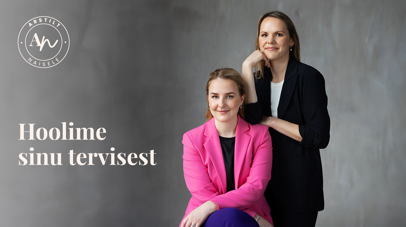
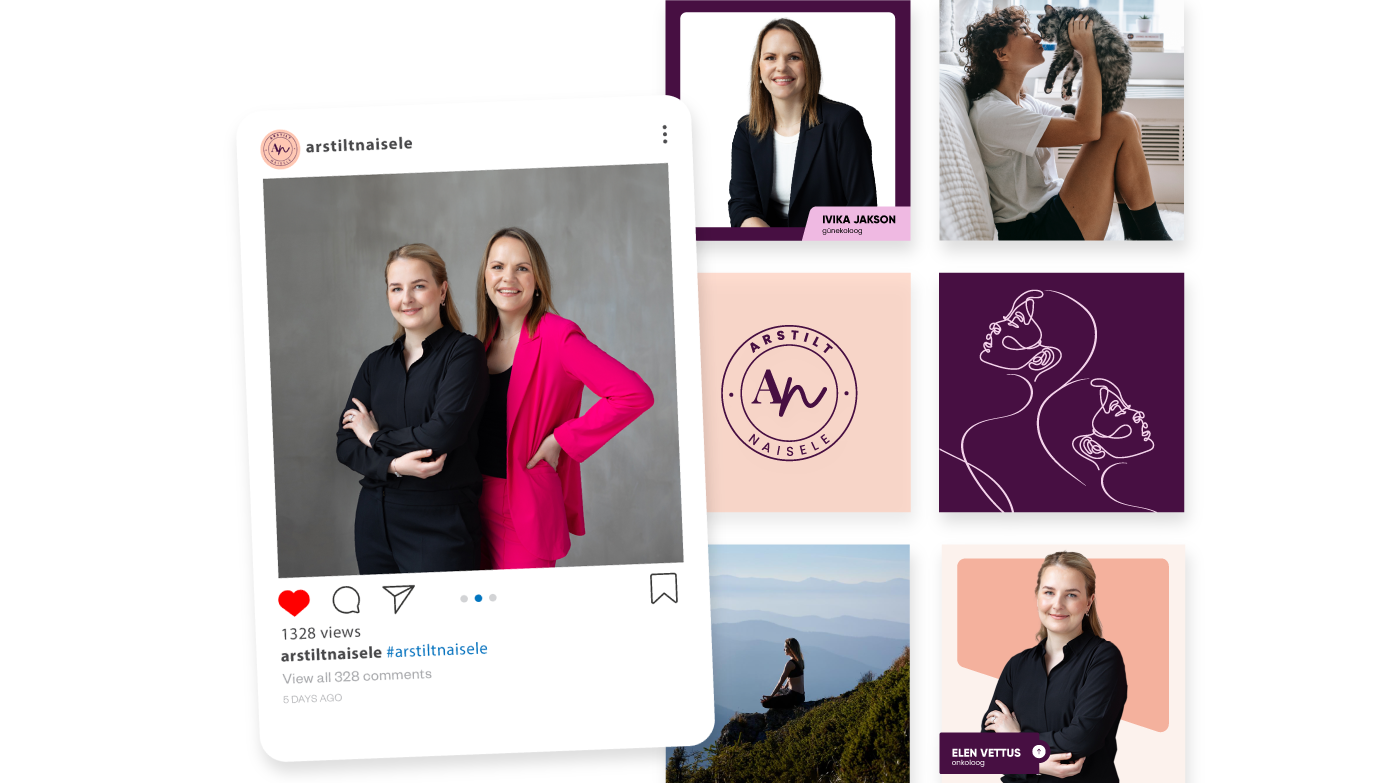
Ivika Jakson (gynecologist) and Elen Vettus (oncologist) are behind the brand Arstilt naisele, whose goal is to bring women's health topics to women in a popular scientific way and raise the awareness of women's health based on science.
Their mission is to help women sort out adequate health information in the noise of information, reduce health anxiety, improve quality of life, awareness and share their expertise to a wider audience for greater benefit.
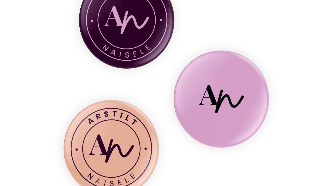
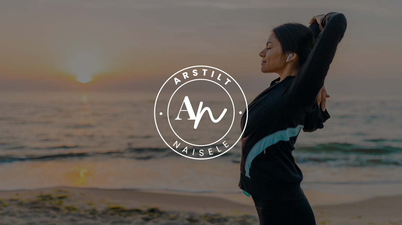
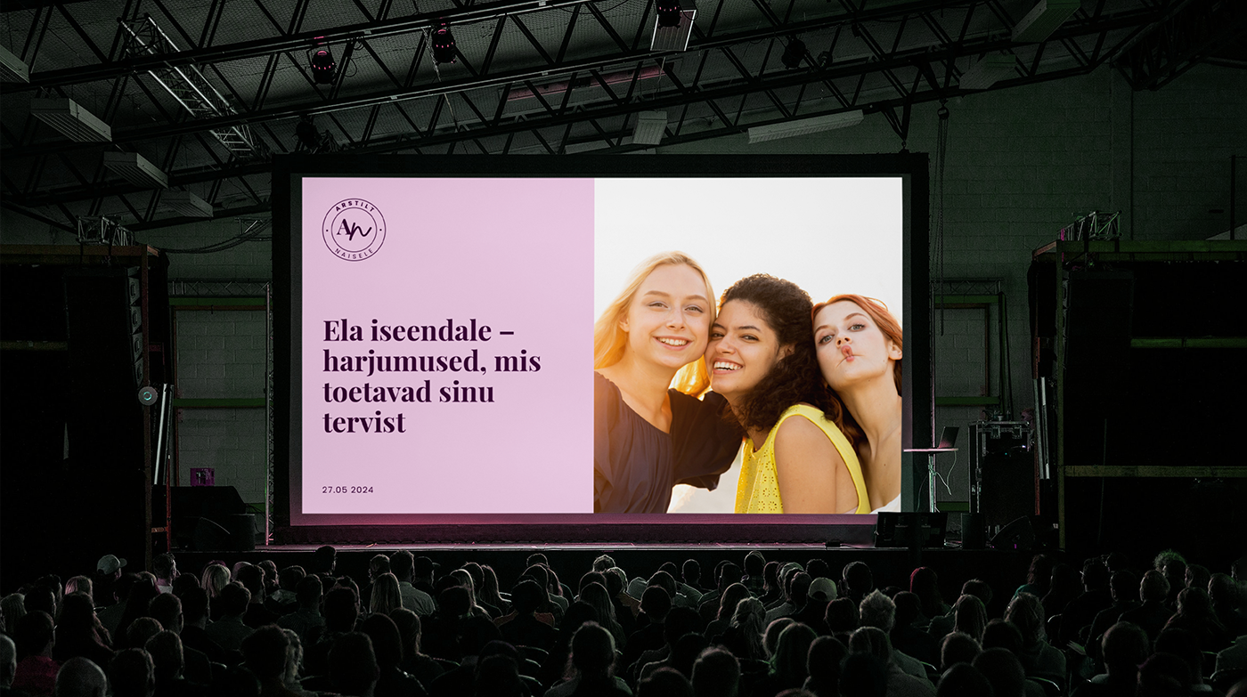
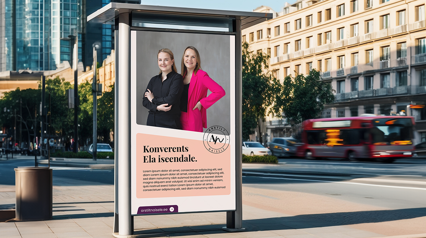
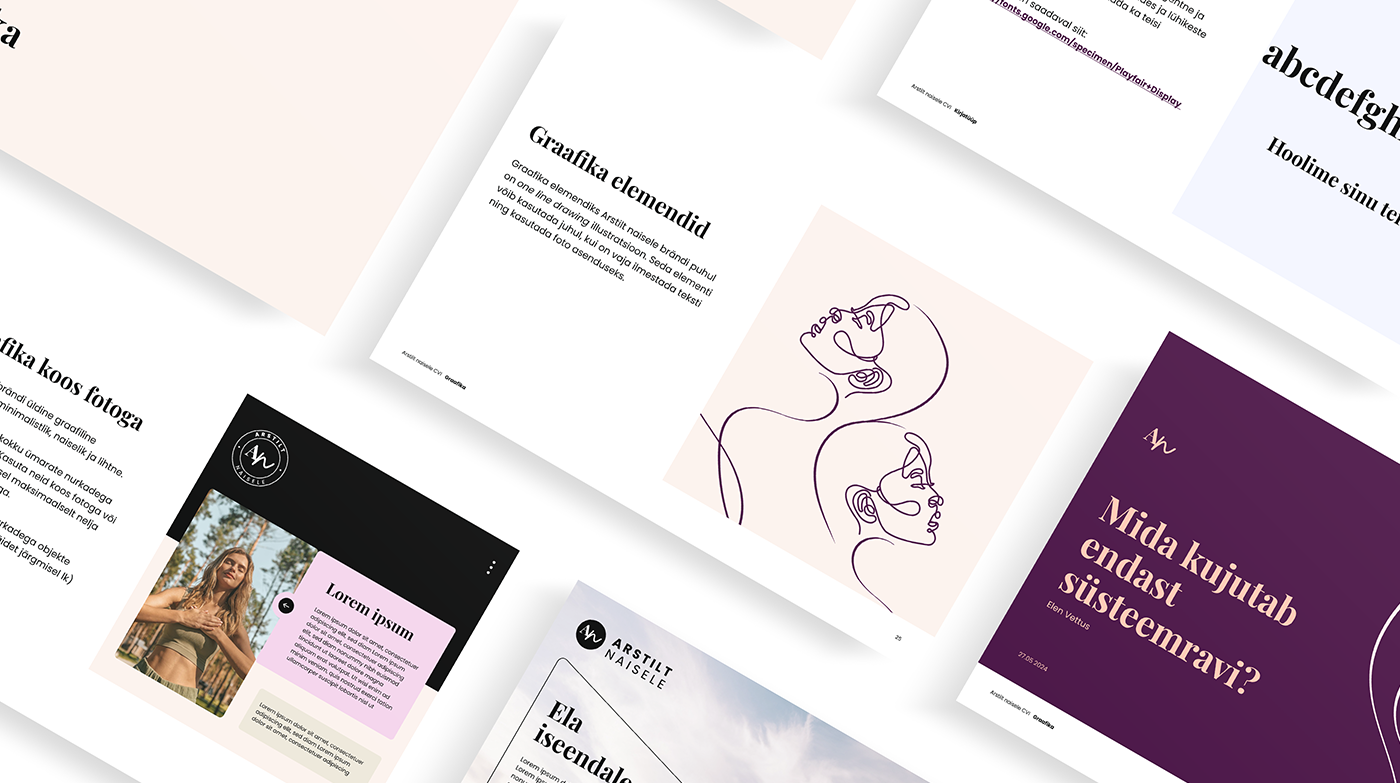
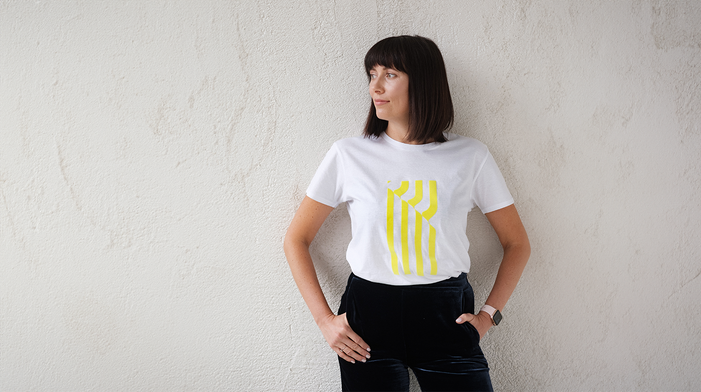
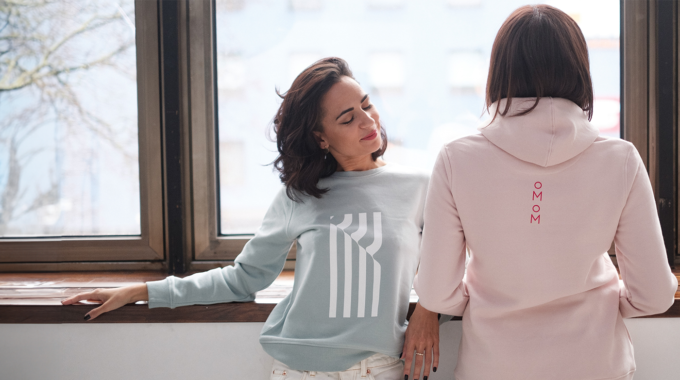
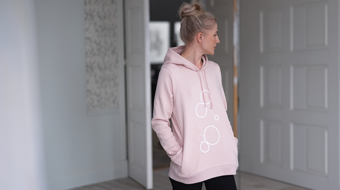
The visual language and colours of the brand reflect a minimalistic elegance. Logo element is inspired by a stamp, which is an everyday part of the work of doctors.
Photos of Ivika and Elen: Krõõt Tarkmeel
- Art direction
- Visual identity


Underground logo
Underground is a jewelry brand designed for a bold man who is masculine and powerful. The jewelry is made of carbide, the usual colors are black, gray, military green, gold. Very strong and durable jewelry.
Some keywords that describe the brand: masculine, stylish, unique, outstanding, minimalist, durable. The logo design is based on the brand's keywords: unique but minimal at the same time. The logo symbol is inspired by the connection between jewelry and a man, he expresses his character through wearing it.
- Logo design
- Art direction


Alibaba sales guide eBook
- eBook design
- Digi


Thermory
- Digi
- Social media


Slow wellness branding
- Brand strategy
- Art direction
- Visual identity


Green Nature branding
- Brand strategy
- Art direction
- Visual identity


Green Nature packaging design
Green Nature is an Estonian natural cosmetics brand. They have been operating since 2008 and their goal has been to produce cosmetics from pure raw materials and high quality. The brand name clearly refers to naturalness and purity. The client's goal was to harmonize the products visually and speak to their target group.
- Packaging design
- Art direction


OMOM prints
oMoM is a clothing brand that offers comfortable elegance through T-shirts and hoodies. The keywords are simplicity, elegance and organic cotton. I helped to design a logo and prints for T-shirts/hoodies.
photos: Birgit Varblane
- Logo design


Magazine design
A workshop of the Indesign program was held at EKA where the goal was to create a design for the magazine. All content are from www.trendland.com and www.wgsn.com.
- Catalogue design


PÖFF
The Tallinn Dark Nights Film Festival, which started in 1997, has grown into one of the largest film festivals in Northern Europe. Visuals have been created for PÖFF 23 2019 social media channels.
- Social media


Illustrations and collages
Illustrations and collages inspired by music, starlight, love and fairy tales.
- Illustration
- Collage


